
I feel like venting for a second.
..Or for a few paragraphs.
I have an artistic pet-peeve.
Now, I am going to make it clear right here that there are a lot of artists that get published that do not design well. But, for the most part, I think most are misunderstanding the beauty of simplicity, expression, and composition. Most artists compose everything. They design the character, the environment, the negative (or empty) space, the text...everything. If it looks simplified, it is because they meant to draw it in that style, not because that is the only way they know how to draw.
I read in a book once that children typically draw really expressive and creative until they hit about 10-12. Then, they develop this fascination with realism. They want everything they draw to look like it does in their mind, or in real life. They get frustrated when doesn't, and they loose their passion for creating for the sake of creating. Who cares if a 4-year-old draws her mom with 10 fingers? I bet she had a blast making all those lines! (AND, sadly, many parents, siblings, and teachers also stifle children's creativity at this age by pushing realism. For example "the grass isn't purple," or "That doesn't look like Bobby!" But that is a vent for another day.) (AAAAAND, let me add that I loooove realism, and this is in no way a kabosh against representational art.)
So, according to the book I read, that is why most adults draw like a 10-12 year old. Because that is when they basically gave up. Tragic day.
Wow, that was a side track. I am talking about misunderstand art here.
Here are some examples:
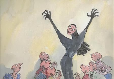
A) One of my all-time favorite illustrators is Quentin Blake. He illustrated many of the Roald Dahl books. I am ashamed to admit it, but as a child I really disliked his artwork. I thought it was sloppy. But now, I love the way his marks are so expressive and loose, and they are all beautifully, and simply composed. You can tell he has fun with each illustration. I would really love to hang a print in my home.


B) Picasso. I think he was artistic genius, but his work--especially his cubist pieces, are definitely over critiqued by the ignorant.
Pablo Picasso was actually an incredibly skilled realist painter. You can see his progression in early paintings:

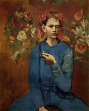
But he was passionate about discovering and pushing the envelope. Cubism was the result of finding geometric shapes in the human form, and depicting multiple planes at the same time.


I love what Lori McNee says, "He learned the illusion of volume then he deliberately learned how to flatten it. It didn’t happen overnight. In fact, he spent his whole life trying to remember how to paint like a child! Despite his childlike painting, there was never a man who explored art more seriously."
I am a fan of Picasso. I love how he wasn't afraid to change his style as he learned and discovered.
C) The KING of the 'bad-art rap' is non-objective or abstract art. This is something I am really passionate about defending, because non-objective art is all about the design and composition, or it is about a specific statement. Of course I don't find all abstract art beautiful. But I'll defend them never the less....
I love making my own non-objective art. It is a stress-relief, especially when I am working on a big project with a lot of people that look like people and so forth. Sometimes it just feels so good to pull a "Jackson Polluck" and get crazy with the paint (or pixels in my case)...

(A painting by Jackson Polluck. He was known for putting a canvas on the floor and throwing paint at it. I don't know about you, but it sounds like a blast. I would love to get paid millions of dollars to do that.)
Here are some other examples of famous shape-oriented pieces that I find beautiful.

This piece by Josef Albers called Homage to the Square: Confidant is a great example of the beauty of simple shape and careful composition. He demonstrates that colors have value (or a lightness and darkness), and that ordering the values helps emphasize a focal point. I love tidy, neat lines...probably because that isn't usually how I paint. But there is something profoundly beautiful to me about order, and clean, crisp lines.

This piece by Mark Rothko, No. 13, I would love to hang in my home. I love anytime I see the artist's brushstrokes on their work, because it is like seeing their thought process. I guess it is a little like having a mathematician 'show their work' on paper. I also love the 'torn' paper look with the uneven edges. And, while they are rough and uneven, they still easily communicate 'rectangle.' I also easily find a symbolic meaning with this...the white rectangle seems to be transcending the others...like a spiritual or uplifting experience.

Composition with Red, Blue and Yellow, Piet Mondrian. I guess I really do have a thing for squares and rectangles, because I just realized all the examples I chose are really geometric. I love the power of contrasts in this piece..the values are controlled well to bring your eye to the red square, then down to the yellow, then to the blue. I also love the variety of the lines..some are thicker and some are shorter. Definitely not a boring painting!
And just to mix it up, here is a more organic one:

This is by Theresa Paden. Check out more of her art at http://www.abstractartistgallery.org/theresa-paden/
The colors and values frame the composition well, and I really enjoy the juicy brushstrokes. Truly a beautiful painting.
I'm not saying you have to find all art beautiful, just try to understand it. Beautiful compositions take a lot of trial, error, practice and patience to perfect.
And just for fun, here are a few that I did!


No comments:
Post a Comment